Perfect Properties
Real Estate App
Overview
Perfect properties is a responsive web app designed for people who are searching to purchase property as their next new home or as a financial investment. Perfect Properties main goal is to provide them with the expertise needed to help users search efficiently for the perfect property that fits their needs.
The Design Process - UI design
In this project I used user-centered mobile-first design approach and focused on a simple, intuitive and fun UI design.
Understanding the problem
Users’ problem brief: New property buyers want to have a way to search for the perfect property for their needs, whether it’s for finding a home to live or property for an additional income or financial security.
Possible solution: A database of properties which includes relevant and detailed information on each property to help users in their decision-making process.
Ideation
Based on the problem brief and the persona, I crafted user stories and user flows to help me design the app’s features.
User persona
User stories
Buying property is an exciting, emotional and also complicated experience for users who want to achieve financial security or find their next home. Therefore each feature was designed based on users stories.
User flows
Based on the key objective of the persona and user stories, I designed the tasks flow for achieving the users' goals.
Sketches & wireframes
Next to the ideation step, I started sketching low fidelity screens with only pencil and paper to help me demonstrate my early thinking and ideas.
Low fidelity sketches
Mid-fidelity Wireframes
After my rapid sketching, I started to think about the UI elements and spacing required in the app. I chose a 12 columns grid and created mid fidelity screens on which I organized the hierarchy between the UI elements.
Building the brand
Moodboard
I started with creating a moodboard to get some inspiration for colors, imagery, typography and general look and feel for the app.
Colors
I believe that home is a place where one should feel secured and relaxed. The orange evokes the feeling of warmth and energy and supports the app goals of helping users in their journey to find a home for financial security for their families. Blue is a good color to evoke the feeling of trust, serenity, and relaxation. I believe these colors combine perfectly together and give a modern look to the app.
Applying the colors on the app screens


Style guide
I designed visual style guide for the brand, which describes all the design components and UI elements. The brand should keep a consistent modern and professional look and feel to support the product’s goal - to provide professional guidance and opportunities to new buyers to find their next dream house.


Designing for different breakpoints
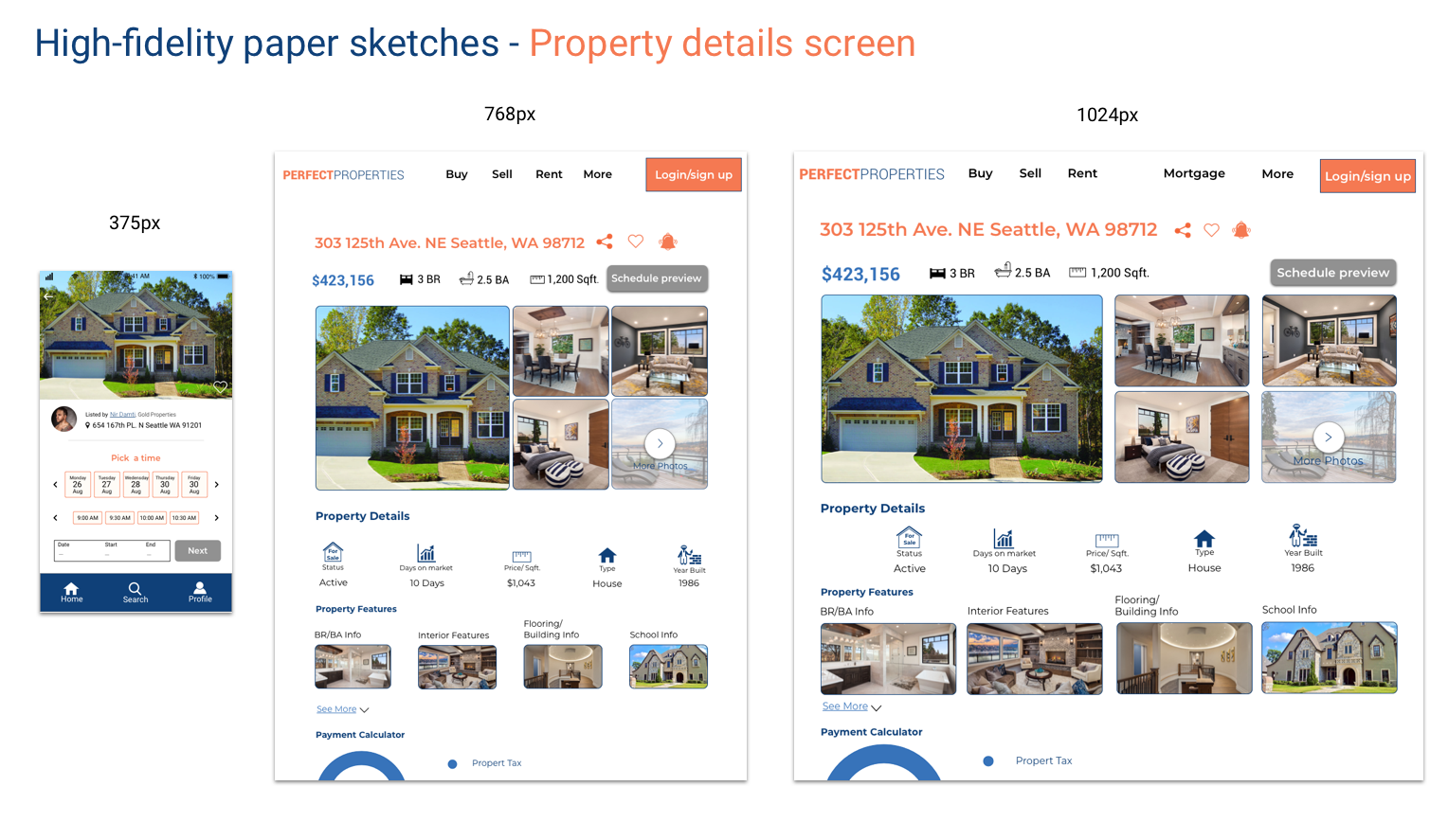
My user-centered responsive design process started with a mobile first approach. This design strategy, helped me make sure my designs will look good even on the smallest screen and I could easily adapt them to larger screens as well.
Final UI design & Mockups
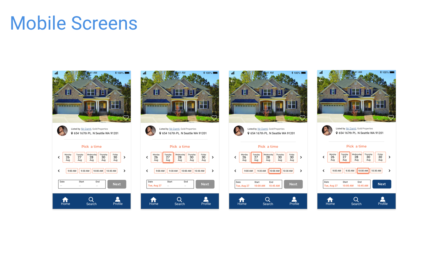
Guided by the visual style guide, I designed the mobile high fidelity wireframes.


